How to make your Call to Action Buttons Irresistible

A lot makes up for your call to action buttons’ success. You can use creative and attractive content to pull people, you can write catchy and concise copies, you can produce videos and post photos to engage with your audience and so on so forth. But one thing really decisive is to make your call to action buttons themselves irresistible.
There are a few key factors that differentiate simply functional call to action buttons from perfect and standout ones.
One Team lists you those steps for making your call to action buttons simply irresistible.

1. Make your button noticeable and accessible
No matter how much of a good job you’ve done creating, optimizing and designing your call to action button, if your visitors aren’t easily and immediately able to notice it, the effort you’ve put is useless. The average attention span of people in general is little and the average attention span of younger generations specifically is even less. You should make the call to action button one of the first things your target audience pays attention to when visiting your page.
The most basic and fundamental aspects in your buttons success is access and noticeability.

2. Use colors aligned to your target audience
The color of your call to action button is really important. People generally have certain psychographic characteristics. Those should determine the color you’ll choose. Based on your target audience, pick a color that grabs the attention and creates a certain atmosphere or mood.
Generally, you should avoid white, gray and black, because they’re not that distinguishing or may not feel that exceptional.
Keep in mind that the color of your call to action button should be correlated with its background, and not clash with it in order to feel aesthetically good.
An online tool which helps you pick the right call to action button colors is Button Optimizer.

3. Define size
You might think that making a button as big as possible will make it as powerful as possible. That’s not necessarily true. People usually are uncomfortable and bothered when they see a call to action button covering most of the landing page. It seems as someone is trying too hard to push something towards them. It’s obviously annoying to make them feel like a subject of consumerism or marketing.
Don’t forget that you want people to click on your call to action button, and in order to do that you need to make it attractive and friendly. Size plays an important role in all that.
Note that you should make any necessary size adjustments for mobile visitors as well.
4. Focus on a single objective
A basic fundamental in maintaining the attention and interest of your audience is displaying as much information as needed and not boring or confusing them with extra unnecessary stuff.
There is some sort of uncertainty in people’s minds when they come across multiple different call to actions for different objectives in a single button. It’s better to focus on the most complete or centric objective of each case and build your call to action button and landing page around it.

5. Don’t let your audience stay inactive
Create a sense of urgency to your target audience by using time and availability as a decisive factor. Push them in some sort of way to make an immediate choice rather than leave the decision to another day after taking the time to think about it.
Visitors shouldn’t feel like they have all the time in the world. Let them know that what you offer might be there now but it won’t be there forever.
You can urge them to act quickly regardless of stock availability. In that case, let your targeted people know how much time they have left before clicking. Create a deadline for no specific reason.
6. Make your call to action clickable
It makes perfect sense that since your call to action button is a button it should be clickable.
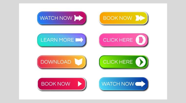
There are a few characteristics that differentiate buttons from other formats. Your button should be rectangular, have clear boundaries and a color that distinguishes it from the rest of the webpage. That means you shouldn’t spend too much money, effort and energy on making it alternatively artistic, standout and different.
A key ingredient that essentially makes your call to action button clickable is through putting action words in it. Available actions should be two choices at most.

7. Make your button mobile friendly
Researches show that around 70% of online consumers spend most of their time on a mobile phone. That tells you how much focus should be put on optimizing your button for smartphone users.
Even today, many businesses don’t do necessary adjustments and probably don’t consider that a decisive factor for their call to action success. If you run a website that offers the exact same thing with another website and your call to action is easier to handle and understand, it makes perfect sense that the consumer will put his money on the more reliable choice.
For more information on effective call to action and other marketing and communication matters feel free to One Team!


